Sunday, February 22, 2015

Field Exercise 4 - Flight Simulator and UAS Mission Planning

INTRODUCTION


            Field exercise four was a two-part task. The first task was to log two hours of Unmanned Aerial System (UAS) flight time using the UAS flight simulator program (Real Flight 7.5). Logging two hours on the UAS flight simulator was done in order to perform the next task which was to plan two UAS mapping missions. By drawing on the 2 hours of previously logged UAS simulator experience, students would be more accurate regarding their selected missions' data acquisition methods. Gaining experience with the different types of UAS platforms through flight simulation put the students in real scenarios that arise in the field. Some of these scenarios included difficult terrain, high winds, and poor visibility. Using the UAS flight simulator also equipped students with the knowledge of the advantages and disadvantages of the different UAS platforms available. Two hours of logged flights might sound like an eternity, but it was really only enough time to scratch the surface of a UAS's data acquisition potential. Besides learning about an Unmanned Aerial Systems different potentials for data acquisition, students of course also became more comfortable with actually flying the different platforms!

Unmanned Aerial System Overview


            Unmanned Aerial Systems (UASs) have the potential to completely change geospatial technology as the world knows it. UASs are cheap to purchase and operate, versatile in design, quick to produce imaging results, and they're easier to operate than a manned aircraft. UASs can even be programmed to fly their desired route without a pilot ever manually controlling the UAS (for safety reasons there should always be a pilot on standby to manually take over if necessary). Instead of hiring a highly expensive manned aircraft that may cost tens of thousands of dollars, a UAS can be deployed for a fraction of the cost. By simply attaching a light weight high tech camera to the UAS, it can function the same way an actual imagery aircraft does.
            There are many different types of UAS's but the two broad categories that they fall under are fixed wing and rotary Unmanned Aerial Vehicles (UAVs).
            A fixed wing UAV is any vehicle that utilizes a simple airplane design where lift is achieved through lift and the manipulation of wing flaps. A Fixed wing UAVs propeller/propellers are usually powered by batteries or solar cells. When a fixed wing craft is battery powered it's flight time can be anywhere from 20 minutes to a few hours. The flight time is relatively short with battery power because the weight of the batteries is taxing on the aircraft itself. The recent emergence of light high powered batteries is the reason why battery powered UAVs have become popular in the first place. Eventually a UAV powered by battery will reach its battery limit where the weight of extra batteries outweighs the added power. This is why adding a larger battery for more flight time does not work. UAVs powered by solar cells on the other hand have much longer flight times as long as their is sufficient sunlight to power the cells. Both of these UAV types (battery/solar cell) can be automatically controlled via computer of manually via remote. When it comes to data acquisition, fixed wing UAVs are excellent at obtaining aerial imagery in long linear swaths over large areas. Fixed wing UAVs also have higher payload capabilities when compared with rotary UAVs because they have air lift to aid them in their flight (something rotary UAVs do not have). Figures 1 and 2 below are examples of a battery powered and solar cell powered fixed wing UAV respectively.
Figure 1: Depicts a fixed wing UAV with a single motor powered by battery
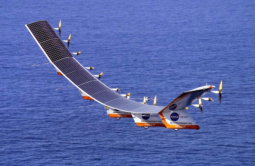
Figure 2: Depicts a fixed wing UAV with multiple motors all powered by solar cells
            Rotary UAVs are vehicles that use a spinning propeller/propellers to obtain lift and flight. Rotary UAVs can have anywhere from one to eight rotors, and these rotors are normally powered by batteries. As is the case with battery powered fixed wing UAVs, battery powered rotary UAVs have notoriously short flight times. These flight times can be as little as ten minutes and rarely go over an hour. Such short flight times are due not only to the weight of the batteries, they are also short because rotary UAVs don't have wings to aid them in lift. Wind does not help to keep a rotary UAV afloat, it only makes it harder for it to stay in the air. This means that rotary UAVs have poor payload capacity. Even though they have short flight times, rotary UAVs are essential aerial image data acquisition because they can hover and move at extremely slow speeds. Figure 3 and 4 below are examples of a single and multiple rotor UAV respectively.

Figure 3: Depicts a battery powered UAV with a single rotor located on top of the craft (helicopter)
Figure 4: Depicts a battery powered UAV with multiple rotors. This is a true UAV image because the aircraft has an imaging device (camera) mounted to its bottom.

METHODOLOGY 


Flight Simulator and Flight Log


            In table 1 below my flight simulator log and ensuing notes can be viewed.

Table 1: contains the following fields: trial #, platform, platform type, venue, view, flight time, crash description, and notes.  


            Experiencing the strengths and weaknesses of the different types of UAVs on the flight simulator was essential to understanding how each one can collect aerial imagery. As seen above in table 1, a nose or chase view of the UAV was the easiest way to navigate rough terrain. The more realistic or fixed view was the toughest of views. Wind greatly affected the fixed wing UAVs while it did not have as much of an effect on the rotary UAVs. This piece of knowledge may come in handy on days when storms or high winds are predicted. While the fixed wing UAVs generally held speeds over 40 mph, the rotary UAVs hovered and could be made to inch along if necessary. This was especially easy with the hexacopter 780 which had much better handling than the gaui 330 X quad-copter. Being able to hover and move slowly can be a huge advantage in certain scenarios involving the collection of aerial imagery. In other scenarios the speed of a fixed wing aircraft may be the desired UAV feature.

UAS Mission Planning


            Now that I have gained some experience regarding the strengths and weaknesses of the different UAV types using the flight simulator, it's time to put that knowledge into action regarding aerial imagery scenarios. My job is to plan out the best way to utilize a specific UAS in order to solve
presented issues regarding two aerial imagery scenarios

Scenario 1: A mining company wants to get a better idea of the volume they remove each week. They don’t have the money for LiDAR, but want to engage in 3D analysis

            In order to determine the volume of fill removed from an open pit mine a three dimensional image of the mine is required to produce a DEM (digital elevation model) of the mine. Obtaining these three dimensional images can be done through a Photogrammetry camera systems mounted on a fixed wing UAV. A fixed wing UAV will use a long flight path with the ability to make multiple passes of the same area at a higher rate than a rotary UAV. Photogrammetry camera systems have automated film advance and exposure controls, as well as long continuous rolls of film. Aerial photographs should be taken in continuous sequence with an approximate 60% overlap. This overlap area of adjacent images enables 3 dimensional analysis for extraction of point elevations and contours. Once the images have been shot by the fixed wing UAV, a technique called least squares stereo matching can be used to produce a dense array of x, y, z data. This is commonly called a point cloud. A point cloud is a set of data points displayed in a coordinate system to represent the external surface of an object as shown in figure 5 below. An interpolation technique such as kriging is used to "smooth" the surface of the data.
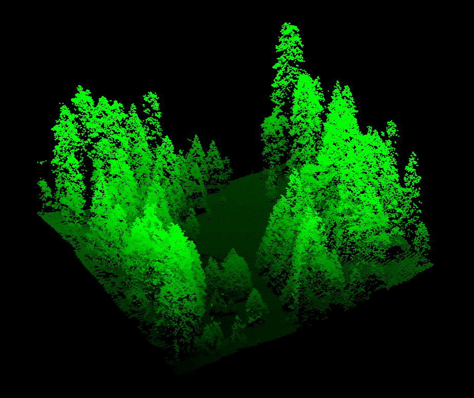
Figure 5. A point cloud representation of a section of forest. The spaces in the images show where data was not collected. Since the data is in the form of points there is bound to be numerous gaps in the data. An interpolation technique is used to fill in the gaps using data from the points to estimate the data for the gaps.
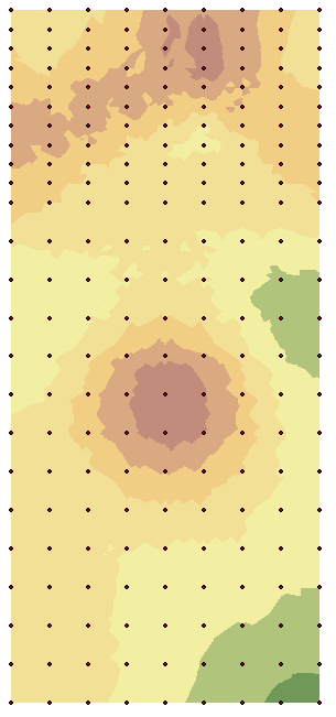
            A DEM image like the one in figure 6 below can then be modeled in ArcGIS to accurately reflect contours of the mine as well as the elevation levels of the mine.
Figure 6. An example of a three dimensional DEM with the color gradient representing elevation; the more red the higher, the more blue, the lower.
            Since the elevation of the mine will be known from the first DEM created, subsequent missions with the UAS to create new point clouds will reflect elevation changes. From these elevation changes in the mine a volume analysis can be run to determine how much fill has been removed.
             Obtaining an elevation point cloud with a fixed wing UAS equipped with a photogrammetry camera system, is much faster and efficient than manually surveying the mine. UAS missions can be done as often as needed with relative ease, saving your company large amounts of time and ultimately money. This method is not as accurate as using LIDAR data, but it is much cheaper and less taxing on the computer creating the DEMs. If you were to take weekly readings of the mine using LIDAR you would spend a fortune on data collection. I see photogrammetry as your most viable option if you are set on taking weekly volume tests.


Scenario 2: An atmospheric chemist is looking to place an ozone monitor, and other meteorological instruments onboard a UAS. She wants to put this over Lake Michigan, and would like to have this platform up as long as possible, and out several miles if she can.

            An Unmanned aerial vehicle (UAV) that can be equipped with an ozone detector and fly for as long as possible are the specs. Using a fixed wing solar cell powered UAS is going to be the best option here. This is, however, completely dependent on budget constraints. A reliable solar cell powered UAV that can fly in the upper atmosphere for years at a time will cost nine million dollars. This type of UAV is basically one step under a satellite and requires an extensive unmanned aerial system (UAS) monitoring team. In figure seven below a sophisticated solar cell powered UAV is pictured. 


Figure 7: Titan Aerospace's SOLARA 50, a solar cell powered UAV that can stay afloat for up to five years.
             A cheaper fixed wing UAV powered by solar cells could also be used and it could be had at only a fraction of the cost. This type of UAV would not fly in the upper atmosphere; therefor, it could only be deployed on days where there's ample sunlight to power it. As long as there is enough sunlight, however, the sky is literally the limit. Ozone detectors can weigh as little as a pound so payload should not be an issue for either UAV option. Both UAV options will require a monitoring team of at least three people to keep tabs on the aircraft. This three person operation is what creates an unmanned aerial system. Because visual contact will not be maintained at all times with the UAV, it will be necessary to equip it with a nose camera so a first person view can be referenced if necessary. The job of keeping visual contact with the UAV goes to the spotter or aircraft detail. Actively collecting ozone data is done through a command and control link set up. This will be the job of the person actually conducting the scientific research or data acquisitioner. The UAV will have to have some place to send the acquired data. This is normally a computer station and it is run by the engineer. A full briefing of an UAS can be perused here.

Sunday, February 15, 2015

Field Exercise 3 - Development of a Field Navigation Map and Learning distance/bearing Navigation

INTRODUCTION

            Navigating over land using only a map and compass can be a useful skill when these are the only tools available. Many times there are better and more advanced methods of navigation because of high tech geospatial devices. However, these high tech navigation devices can cost a lot of money, and such a high level of navigation is sometimes not necessary for simple excursions. High tech navigation equipment can also be quite cumbersome and bulky which can slow someone down if they're navigating across rough/difficult terrain. Compass and map navigation; therefore, is often times the cheapest, easiest and quickest option where land navigation is concerned. There is actually a sport called orienteering that involves competitors using only a map and compass to navigate from point to point as a type of race.
            The tasks to be performed before actual navigation can occur in field exercise three are two fold. First, the navigator must measure his/her pace count. A pace count is taken so that the navigator can accurately pace off distances on their map that corresponds to the area they are navigating. Second, the navigator must create an appropriate map of the area to be navigated. In my case two maps will be created that correspond with my area of interest (the UW-Eau Claire priory). The first map created will be a Universal Transverse Mercator (UTM) coordinate system with a 50X50 meter grid attached for the purpose of easily measuring off my pace counts. The second map will be created using a Geographic Coordinate System (GCS) that shows the actual latitude and longitude associated with my area of interest. The second map will contain a grid as well, but one that is measured out in decimal degrees.

METHODOLOGY

Pace Count

            The first task I had to complete before navigation could occur was measuring my pace count. A pace count is usually measured at 100 meters. Basically a person counts how many paces they take within that 100 meters to figure out their 100 meter pace count. A pace equals two steps or every time the right foot takes a step. An average pace count for a person of average height (5'5"-6'0") would be between 60 and 70 paces per 100 meters. For example, I'm 5'10" and I have a pace count of 65. Now that I know that I take 65 paces in 100 meters I can create a grid map that allows me to accurately pace off distances in meters. Below in figure 1 is an example of my pace count break down

Figure 1: My pace count breakdown at distances of 100, 50, and 25 meters.


Map Creation

            The second task I had to complete before navigation could occur was creating the two maps of my area of interest (the UW-Eau Claire priory). This task was completed using the program ArcMap 10.2.2.

The Geodatabase
            First I had to import the priory data provided by the instructor. The entirety of this data was held inside the priory geodatabase. A geodatabase is a repository for files that contain the same spatial data and can perform interoperable tasks. Interoperability is the ability of feature classes to work/communicate with one another and is one of the main strengths of a geodatabase. The old system of geospatial technology relied on shapefiles that contained separate spatial data and could not perform interoperable tasks.

Adding Feature Classes
            Because of interoperability I was easily able to add and omit feature classes that would aid my map or harm it. I added the five meter contour lines feature class, the navigation boundary feature class, and an aerial image of the priory to create my two maps. I omitted every other feature class because they added many unnecessary details my maps would not need. In figure two below, all features within the priory geodatabase are shown. Figure three below shows the maps as they appear after the three feature classes have been added.

Figure 2: Shows all the feature classes within the priory geodatabase. The priory geodatabase is circled in green, and the feature classes within the geodatabase that I added to the maps are circled in red.

Figure 3: shows the two maps of the UW-Eau Claire priory. The 5 meter contour line feature class is depicted using dark red and lime green lines, the navigation boundary feature class is depicted using a faded grey outline, and the aerial image of the priory can be seen as the base for the whole map.

Projecting the Data

            After the desired feature classes were added to the maps I projected them using different coordinate systems. The first map was projected using the North American Datum (NAD) 1983 UTM coordinate system (15 zone). The UTM coordinate system uses a 2-dimensional Cartesian coordinate system to give locations on the surface of the Earth. The UTM system basically breaks the earth up into 60 vertical zones to keep distortion at a minimum. I specifically used the UTM 15 zone because Eau Claire is located within this zone; therefor, it most accurately displays the geospatial data. Figure four below shows a visual representation of the UTM coordinate system as it pertains to the United States and Eau Claire's placement in it.
Figure 4: shows the UTM zones of the United States. Eau Claire is located in zone 15.

            The second map was projected using the GCS World Geodetic Survey (WGS) 1984 coordinate system. The WGS system uses a standard spheroidal reference surface to define Locations on the earth. This system is not broken down into zones like the UTM system; instead, it is one gigantic system that encompasses the whole earth. This kind of system is more of a broad strokes approach to defining geographic coordinates because there is a mild amount of distortion due to it's all encompassing properties. The UTM systems ability to focus on smaller zones is what make it more accurate than the CGS system.
   

Creating the Grid and Map Elements

            Once the maps were properly projected into the UTM 15 zone I sized them using an 11X17 inch layout. After sizing the maps I then overlaid a 50X50 meter grid system onto the UTM map so my pace could accurately be measured on the maps. To create the grid I navigated into the properties tab which is located in the map's layers scroll down menu. Once inside the properties menu their is a grid tab that will open up the grid menu. Since I knew that I wanted a 50X50 meter grid to be overlaid on my map I used a measured grid with intervals set at 50 meters on both the x and y-axis. There are many other grid options including the amount of labeling and color schemes of the grid. My grid was a standard black grid with five tick marks in between the 50 meter vertical and horizontal grid lines to demarcate ten meter segments. The second grid was created by setting the x-axis interval at .000563 decimal degrees and the y-axis at .000350 decimal degrees. this created a grid that was similar to the 50X50 meter grid. The only other difference besides the x and y-intervals for my second grid was the stroke size of the grid line. I reduced it so the map below the grid would stand out more.
            Once the grids were overlaid onto my map I added the necessary elements to make proper maps. These elements included a north arrow, a scale bar, a projection and coordinate system label, a data source descriptor, and of course my name. Once these elements were added I had two finished maps of the UW-Eau Claire priory. Figure five below shows the two finished maps.

Figure 5: Shows the finished UW-Eau Claire priory maps
          

DISCUSSION

            I ended up only adding three feature classes to my maps: the five meter contour lines feature class, the navigation boundary feature class, and an aerial image of the priory. I did this to create a map that was not too busy on the eyes. This basically meant that I wanted to be able to look at a map that was as simple and bear bones as possible. The fiver meter contour feature class will allow me to observe the changes in elevation and the overall relief of the land surrounding the priory. These contour lines are depicted using easily seen dark red and bright lime green lines. The navigation boundary feature class was not entirely necessary for me to add, but it demarcates my exact area of interest with a subtle dark grey box. Although I could have omitted the aerial image of the priory, I decided to add it to my maps so I could observe features such as trees, roads, and buildings as well as the relief surrounding these features.
            Because the UTM coordinate system is able to focus on specific zones, the UTM map (red contours) had less distortion than the GCS map (green contours). This resulted in better resolution for the UTM map. This being said, both maps are very similar to one another with the key difference being the color scheme of the contours and different grid systems.

CONCLUSION

            Creating these two maps of my area of interest is a huge boon to both my map making and navigation skills. Understanding the background and mechanics of what goes into a map is the best way to become a full fledged spatial thinker. Navigating the UW-Eau Claire priory using the maps I have created is going to be much easier since I'm the one with all the background knowledge. 

Sunday, February 8, 2015

Field Exercise 1 Part 2 – Creation of a Digital Elevation Surface Revisited

INTRODUCTION


Revisiting the Survey Method


            As it turned out, the 171 x, y, and z data points collected in part 1 of lab 1 were not enough to accurately map out all of the features created in the planter box. To be more specific, our group was unable to collect enough points to recreate the thin ridge region. In order to correct this oversight the group decided to resurvey this ridge feature using a 6X6 cm grid system versus the original 12X12 cm grid survey method we previously used as pictured below in figure 1. In order to resurvey the ridge feature created in the planter box, the group had to start resurveying at the y-value of 14. In table 1 below is an example of the new values added to the data set.
Figure 1: The 12X12 cm twine grid system laid over the snow landscape
Table 1: The 14.5 y-values correspond with the first entire new row of x-values
  X                Y                   Z


METHODOLOGY


Inputting the data

 
            The newly obtained x, y, and z-values collected with the 6X6 cm grid system were first added to the original data obtained from the 12X12 cm grid data to create a 216 point data set. Next, these x, y , and z values were placed in a simple excel file and then exported to an ArcMap geodatabase as a point feature class. Once the data had been transformed into a workable point feature class, five different digital terrain models (DTMs) were created for the purpose of finding which model best showed the snowscape features created in the planter box. These five DTMs included a TIN model, a natural neighbors model, a Kriging model, an IDW model, and a spline model.
 

TIN Model

 
            A TIN  (triangulated irregular network) model works by displaying triangles with the data points as the corners of all the triangles. A TIN image has very sharp edges because there is almost zero relief between adjacent triangles. These triangles also do not overlap exacerbating the sharpness of the edges as well. In figure 2 below a 2D TIN model of the data created in arcmap and a 3D model of the data created in arcscene can be viewed along with the corresponding legend.  
Figure 2: 2D and 3D TIN models of the new 216 point data set of the surveyed snowscape 


Natural Neighbors Model


            A natural neighbors model interpolates elevation by assigning weights to data points. When it assigns weights to points it can extrapolate the elevation values for areas in between the actual data points. Unlike the TIN model, the natural neighbors model creates smooth areas in between data points giving it much more relief than the TIN model. Although smooth, the natural neighbors interpolation creates a map that has a lot of variation between collected data points. In figure 3 below a 2D natural neighbors model of the data created in arcmap and a 3D model of the data created in arcscene can be viewed along with the corresponding legend.


Figure 3: 2D and 3D natural neighbors models of the new 216 point data set of the surveyed snowscape 
 

Kriging Model

 
            A Kriging Model uses statistical relationships between the collected data points to create elevation values. Unlike the natural neighbors model, which uses weights to determine values, The Kriging model uses the values of the surrounding data points to determine elevation data for areas between the points. This creates an image that has less variation between collected data points. In figure 4 below a 2D Kriging model of the data created in arcmap and a 3D model of the data created in arcscene can be viewed along with the corresponding legend.


Figure 4: 2D and 3D Kriging models of the new 216 point data set of the surveyed snowscape
 

IDW Model

 
            Like the natural neighbors model, an IDW (inverse distant weight) model uses weights to determine elevation values between data points. To be more specific, in an IDW model the contribution of a point is decreased the more distant it is from a collected data point. The weight of each sample point is the inverse proportion to the distance. Because an IDW model uses weights, it has a similar appearance to the natural neighbors map. It should be noted, however, that the IDW model is very jumpy close to the collected data points. In figure 5 below a 2D IDW model of the data created in arcmap and a 3D model of the data created in arcscene can be viewed along with the corresponding legend.
Figure 5: 2D and 3D IDW models of the new 216 point data set of the surveyed snowscape

Spline Model


            A spline model uses an algorithm that places elevation data throughout the model after it has interpolated all of the collected data points. It basically places a smooth blanket of elevation data over the collected points. Because the spline model attempts to create as much relief as possible between data points, the changes in elevation appear smoother than in the natural neighbors interpolation method. In figure 6 below a 2D Spline model of the data created in arcmap and a 3D model of the data created in arcscene can be viewed along with the corresponding legend.


Figure 6: 2D and 3D IDW models of the new 216 point data set of the surveyed snowscape

DISSCUSION


            As seen in the above images and corresponding legends there are a variety of depth levels represented by different colors. White and grey are the highpoints of the image, red and orange are the mid ground of the image, and yellow, green, and blue represent the low lying depressions of the landscape.
            While the spline and natural neighbor methods created an exaggerated version of the surveyed snowscape, the closest in accurately representing the surveyed landscape was the Kriging interpolation method. While the spline and natural neighbor interpolation methods created the smoothest and easiest to interpret digital terrain model for the viewer, the Kriging method made the best actual representation of the surveyed landscape both relief wise and elevation wise. the four other interpolation methods basically created caricatures of the real landscape that was developed while the Kriging method didn't. This was probably because the Kriging method, as stated above, takes into account the data points in the immediate vicinity to create elevation data for areas in between them. This stops the elevations on the map from jumping up and down so drastically.  


COCNCLUSION


            Considering the fact that only rudimentary tools such as twine, tacks, and a yardstick were used in the surveying process, the actual results were impressive, when visualized as a digital terrain model image. Could a more detailed and accurate survey system have been created to optimize survey results? Sure it could have, but the relative simplicity of the kind of surveying being conducted did not altogether warrant such an elaborate system. In brief, figures 2 - 6 are pretty darn cool compared to the bland landscape seen in the planter box with the naked eye. Being able to use technology to enhance a data set is what groups should take away from this first lab. Not that it was necessary, but if high tech surveying devises were used from start to finish in lab 1, many more data points could have been collected. In this way the data set for the entire planter box landscape would have been flawless. The joy in these labs really came from having to work together in the cold, and having to overcome the mistakes that inevitably ensued due to the unfamiliarity with surveying in general.       

Monday, February 2, 2015

Field Exercise 1 – Creation of a Digital Elevation Surface

INTRODUCTION

 
            The objectives for lab 1: Creation of a Digital Elevation Surface were threefold. First, a variety of landscape features including a ridge, hill, depression, valley, and plain had to be created inside of a 3.5x7.5 foot snow filled planter box; second, an improvised surveying method had to be created in order to accurately obtain x, y, and z data for the landscape features created in the box; and third, the x, y, and z data collected would be imputed into arcmap for the purpose of creating a digital elevation model (DEM). I should be noted that this third objective will be completed in lab 1 part 2, after revisiting the chosen survey method. The challenge with this lab came with having to improvise a surveying system using only rudimentary tools such as a yardstick, twine, and of course the snow in the planter box.


METHODS
 
Creating the Landscape

            As stated above, a miniature landscape was created inside of a wooden planter box for the purpose of surveying said landscape. Creating the different landscape features in the box didn’t take long because it required very simple scooping techniques. The depression, however, was created by chipping out the frozen dirt, below the snow, with a hammer! Below (figure 1) is a photo of the group creating the snowscape.  

Figure1: Creating the landscape features out of snow
Creating a Surveying Method

            Once the snow landscape was finished, creating an accurate surveying system was the next step. A simple 12x12 cm grid system seemed to be the best way to accurately measure each landscape’s x, y, and z coordinates. Any smaller and the data set would be bogged down with unwanted detail; any larger and the data set would not have enough information to detect subtle changes in the landscape. This 12x12 cm grid pattern was created by measuring off 12 cm intervals down all four sides of the box, and then tacking twine across the box at its corresponding tack mark. The top of the box was considered a z-value of zero, and the deeper the depression in the snow, the more negative the z-value became. In other words while x and y-values measure where a given point is on the grid, the z-values measure depth of any given data point. An example of how an x, y, and z-coordinate system works is pictured below (figure 2).

Figure 2: Y = vertical measure X = horizontal measure Z = depth measure

            Since the top of the planter box had a z measurement of zero, the highest elevation or z-value a given landscape feature could have would be zero. Because no landscape features protruded above the box it was possible to create the twine grid system without having to work around landscape features. Below (figure 3) is the finished product of the completed landscape and 12x12 cm twine grid system.    


Figure 3: The 12X12 cm twine grid system laid over the snow landscape


Data Recording

            Next came the actual recording of the x, y, and z values for each 12x12 cm grid square. Starting with the front left grid in the box, the x-value began at 1 and the y-value began at 1. Moving from left to right there were nine 12X12 cm grid squares and therefore a total of nine x-values. Moving up a row every nine measurement intervals resulted in 19 different y-values for a total of 171 12x12 cm grid squares with both x and y-values. Once the x and y-values had been collected, the z-values had to be measured. By simply placing a yardstick in the front left intersection of every 12x12 cm grid square an accurate and consistent z-value was able to be obtained for all 171 squares. Table 1 below shows the z-values for the entire grid system. Table 1 is also set up in x y coordinate form. For example, grid square 1, A has an x-value of 1, a y-value of 1, and a z-value of 9. Also pictured below (figure 4) is an example of how the yardstick was used to obtain z-values. Be assured that the process of collecting this data was as tedious as reading the explanation of how it was obtained.


Figure 4: Collecting the z-values with a yardstick

Table 1: x, y coordinate plane of the 171 12X12 cm grid squares with corresponding z-values

DISCUSSION
 
             Creating the snowscape, devising a survey method, and collecting the data went off without a hitch. The snowscape was nothing elaborate, making it easy to create. The survey method was uniform and standard, making it easy to collect and interpret the x, y, and z data. Collecting data was tedious and time consuming, but it accurately reflected the elevations of the landscape features created in the planter box.

CONCLUSION
 
          Being able to gather such accurate results to be used later in a digital representation of the snowscape, was a huge boon to the lab as a whole. 171 different x, y, and z data values will surely reflect the changes in elevation over the entire planter box, and give the viewer a detailed digital representation of the snowscape, which will be created in lab 1 part 2.