INTRODUCTION
Revisiting the Survey Method

Figure 1: The 12X12 cm twine grid system laid over the snow landscape
Table 1: The 14.5 y-values correspond with the first entire new row of x-values
X Y Z

METHODOLOGY
Inputting the data
The newly obtained x, y, and z-values collected with the 6X6 cm grid system were first added to the original data obtained from the 12X12 cm grid data to create a 216 point data set. Next, these x, y , and z values were placed in a simple excel file and then exported to an ArcMap geodatabase as a point feature class. Once the data had been transformed into a workable point feature class, five different digital terrain models (DTMs) were created for the purpose of finding which model best showed the snowscape features created in the planter box. These five DTMs included a TIN model, a natural neighbors model, a Kriging model, an IDW model, and a spline model.
TIN Model
A TIN (triangulated irregular network) model works by displaying triangles with the data points as the corners of all the triangles. A TIN image has very sharp edges because there is almost zero relief between adjacent triangles. These triangles also do not overlap exacerbating the sharpness of the edges as well. In figure 2 below a 2D TIN model of the data created in arcmap and a 3D model of the data created in arcscene can be viewed along with the corresponding legend.


Figure 2: 2D and 3D TIN models of the new 216 point data set of the surveyed snowscape
Natural Neighbors Model
A natural neighbors model interpolates elevation by assigning weights to data points. When it assigns weights to points it can extrapolate the elevation values for areas in between the actual data points. Unlike the TIN model, the natural neighbors model creates smooth areas in between data points giving it much more relief than the TIN model. Although smooth, the natural neighbors interpolation creates a map that has a lot of variation between collected data points. In figure 3 below a 2D natural neighbors model of the data created in arcmap and a 3D model of the data created in arcscene can be viewed along with the corresponding legend.


 |
| Figure 3: 2D and 3D natural neighbors models of the new 216 point data set of the surveyed snowscape |
Kriging Model
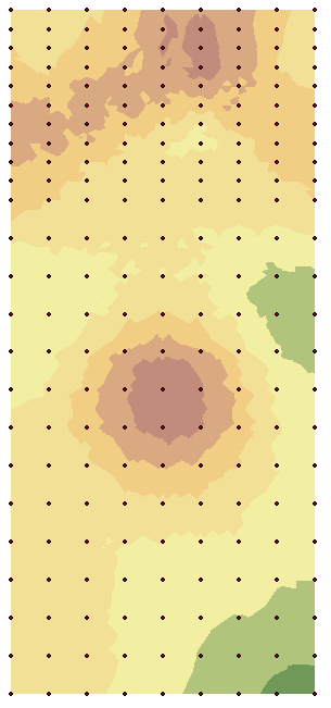
A Kriging Model uses statistical relationships between the collected data points to create elevation values. Unlike the natural neighbors model, which uses weights to determine values, The Kriging model uses the values of the surrounding data points to determine elevation data for areas between the points. This creates an image that has less variation between collected data points. In figure 4 below a 2D Kriging model of the data created in arcmap and a 3D model of the data created in arcscene can be viewed along with the corresponding legend.

 |
| Figure 4: 2D and 3D Kriging models of the new 216 point data set of the surveyed snowscape |
IDW Model
Like the natural neighbors model, an IDW (inverse distant weight) model uses weights to determine elevation values between data points. To be more specific, in an IDW model the contribution of a point is decreased the more distant it is from a collected data point. The weight of each sample point is the inverse proportion to the distance. Because an IDW model uses weights, it has a similar appearance to the natural neighbors map. It should be noted, however, that the IDW model is very jumpy close to the collected data points. In figure 5 below a 2D IDW model of the data created in arcmap and a 3D model of the data created in arcscene can be viewed along with the corresponding legend.


 |
| Figure 5: 2D and 3D IDW models of the new 216 point data set of the surveyed snowscape |
Spline Model
A spline model uses an algorithm that places elevation data throughout the model after it has interpolated all of the collected data points. It basically places a smooth blanket of elevation data over the collected points. Because the spline model attempts to create as much relief as possible between data points, the changes in elevation appear smoother than in the natural neighbors interpolation method. In figure 6 below a 2D Spline model of the data created in arcmap and a 3D model of the data created in arcscene can be viewed along with the corresponding legend.


 |
| Figure 6: 2D and 3D IDW models of the new 216 point data set of the surveyed snowscape |
DISSCUSION
As seen in the above images and corresponding legends there are a variety of depth levels represented by different colors. White and grey are the highpoints of the image, red and orange are the mid ground of the image, and yellow, green, and blue represent the low lying depressions of the landscape.
While the spline and natural neighbor methods created an exaggerated version of the surveyed snowscape, the closest in accurately representing the surveyed landscape was the Kriging interpolation method. While the spline and natural neighbor interpolation methods created the smoothest and easiest to interpret digital terrain model for the viewer, the Kriging method made the best actual representation of the surveyed landscape both relief wise and elevation wise. the four other interpolation methods basically created caricatures of the real landscape that was developed while the Kriging method didn't. This was probably because the Kriging method, as stated above, takes into account the data points in the immediate vicinity to create elevation data for areas in between them. This stops the elevations on the map from jumping up and down so drastically.
COCNCLUSION
Considering the fact that only rudimentary tools such as twine, tacks, and a yardstick were used in the surveying process, the actual results were impressive, when visualized as a digital terrain model image. Could a more detailed and accurate survey system have been created to optimize survey results? Sure it could have, but the relative simplicity of the kind of surveying being conducted did not altogether warrant such an elaborate system. In brief, figures 2 - 6 are pretty darn cool compared to the bland landscape seen in the planter box with the naked eye. Being able to use technology to enhance a data set is what groups should take away from this first lab. Not that it was necessary, but if high tech surveying devises were used from start to finish in lab 1, many more data points could have been collected. In this way the data set for the entire planter box landscape would have been flawless. The joy in these labs really came from having to work together in the cold, and having to overcome the mistakes that inevitably ensued due to the unfamiliarity with surveying in general.
No comments:
Post a Comment